

Main Objective
Make the website reflect the firm's accuracy and turn visitors into enquiries.
A full website redesign for a UK accountancy practice. We replaced unclear, unfinished pages with dedicated service pages, plain-English content and clear contact routes. Sole traders, contractors and limited companies can now see exactly how the firm helps.
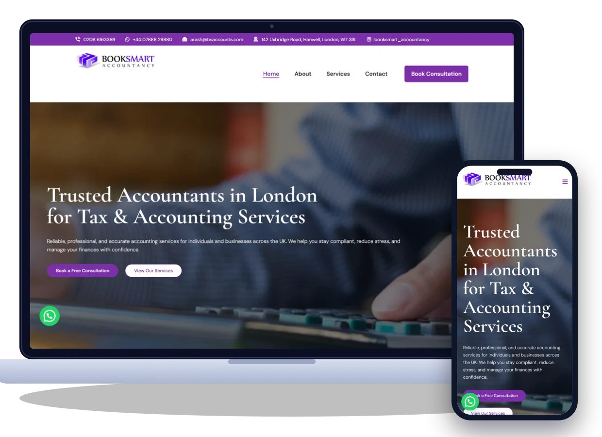
Book Smart Accountancy is a UK accountancy practice with a simple promise: accountancy made simple. They handle annual accounts, bookkeeping, payroll, VAT, Self Assessment, CIS returns, company formation and tax. They also advise owners planning their next stage of growth.
Their old website worked against that promise. Headings were cut short, copy was repeated, leftover placeholder text was still live and there was no obvious way to get in touch. The firm sells accuracy, but the site gave visitors the opposite impression.
Make the website reflect the firm's accuracy and turn visitors into enquiries.
Longer visits, fewer early exits and a steady flow of enquiries.
The firm had the expertise clients need, but four connected problems on the old website undermined it. Each one made the others worse.
Headings were cut off, leftover placeholder text was still live and paragraphs were repeated, so the site looked incomplete.
Visitors doubted the firm's accuracy.
There was no visible phone number, contact form or booking option, so visitors ready to buy had nowhere to go.
Interested visitors couldn't get in touch.
Eleven services sat in one list with no detail. A contractor needing CIS help or a new director forming a company couldn't tell what was included.
Visitors couldn't find their answer.
There were no reviews, team details or explanation of how the firm works, so nothing told visitors they'd be in safe hands.
Nothing showed the firm could be trusted.
What the client wanted to achieve: a clean, professional website that matched their “accountancy made simple” promise, explained every service in plain English and made starting a conversation easy.
Before redesigning anything, we audited the old site, studied competing UK practices and mapped what people want to know before choosing an accountant.
We reviewed every page for broken headings, repeated copy, speed and mobile issues, and built a full list of what had to change.
We studied UK accountancy websites: how they explained services and pricing, showed credentials and made it easy to book a call.
We mapped four groups: sole traders, construction contractors, start-ups forming a company and established limited companies.
People choose an accountant they understand and trust, so we rewrote the content in plain English and put contact routes everywhere.
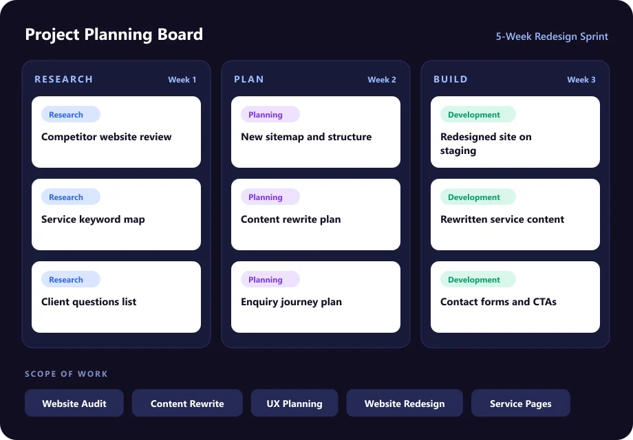
A structured five-week approach kept every stage transparent and on time. Select a stage to see what happened.
We started with a page-by-page audit of the old website. We then spoke with the team about their ideal clients and the questions new clients ask most.
Drag the handle to compare the original website with the redesigned version.
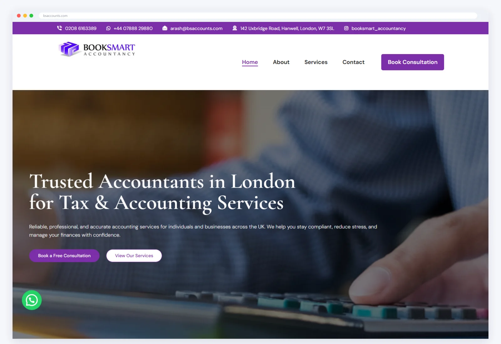
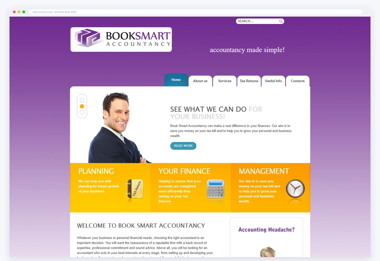
The “before” view is the previous homepage archived in April 2024 (Wayback Machine). The “after” view is the live website.
Four connected workstreams, each one solving a specific part of the challenge.
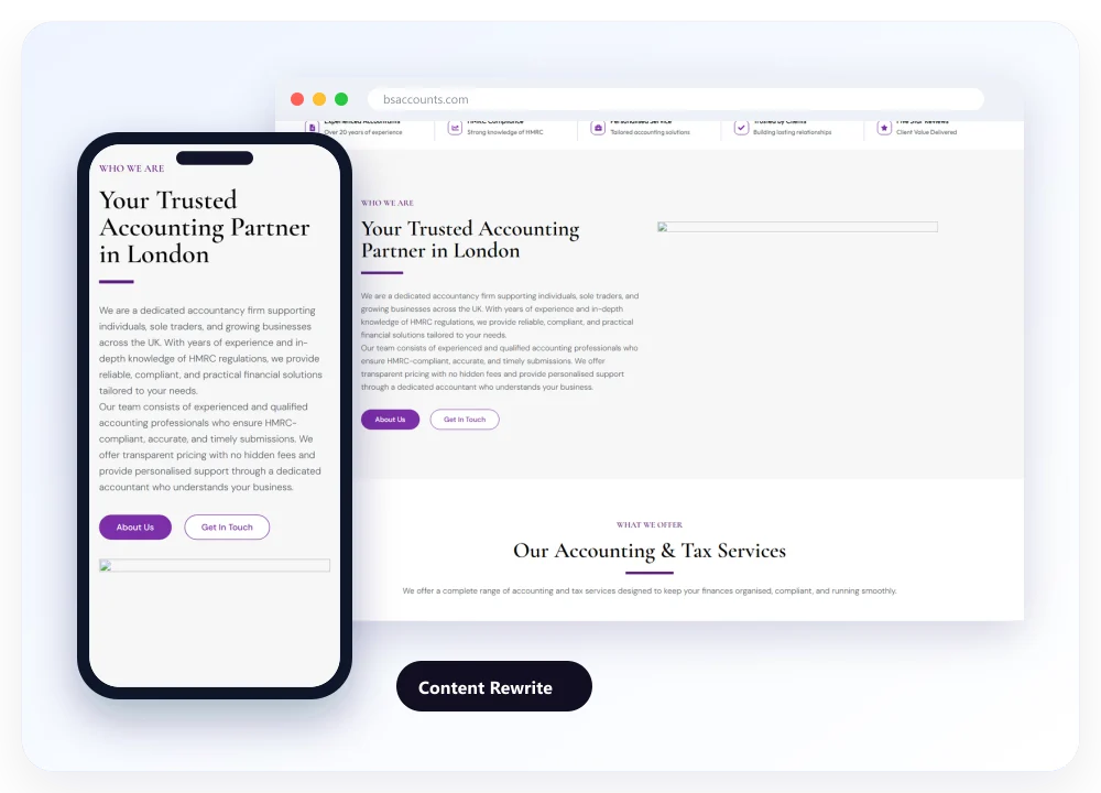
We rewrote every page from scratch, fixing cut-off headings and removing repeated text. Jargon gave way to clear explanations of what each service involves and who it's for.
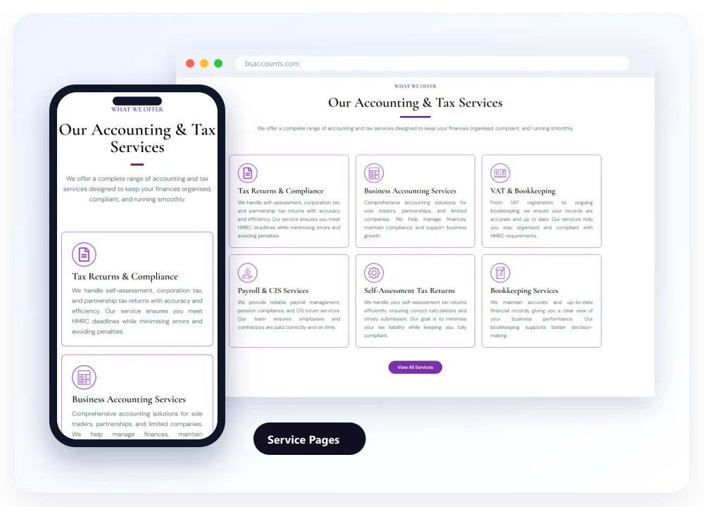
Annual accounts, bookkeeping, payroll, VAT, Self Assessment, CIS returns, company formation and tax each got a dedicated page, so every visitor finds the answer for their situation.
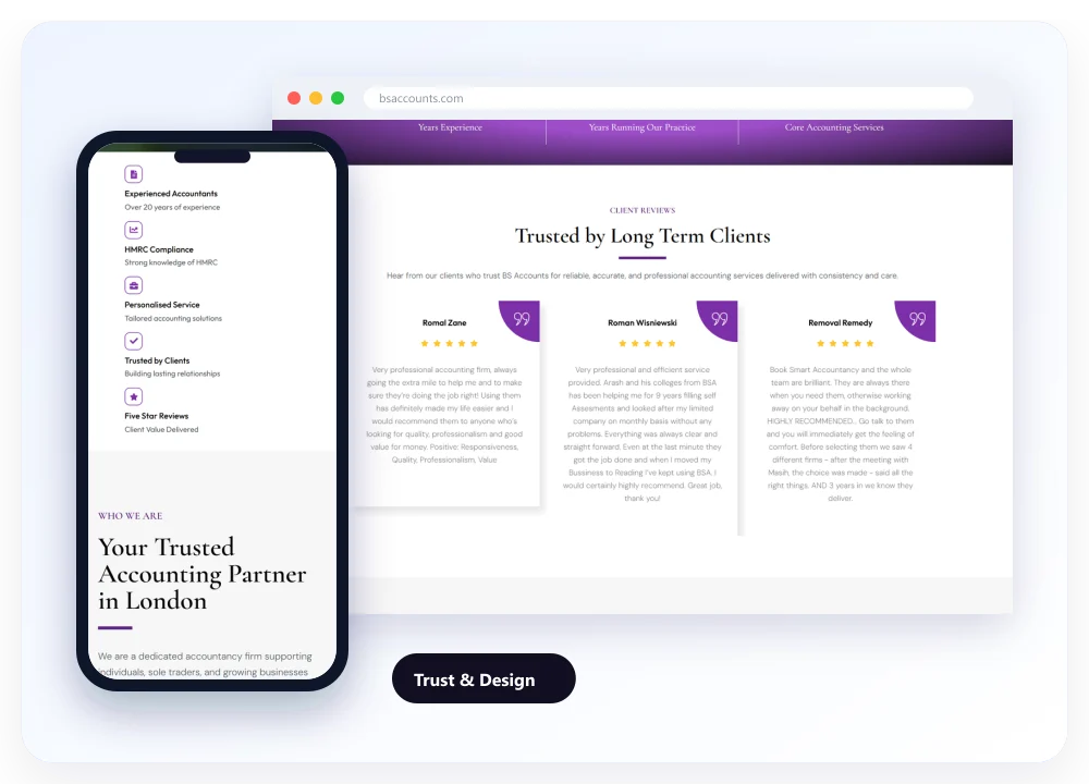
A calm, modern design with a clear structure gives visitors confidence before they get in touch. It explains how the firm works and has space for client reviews.
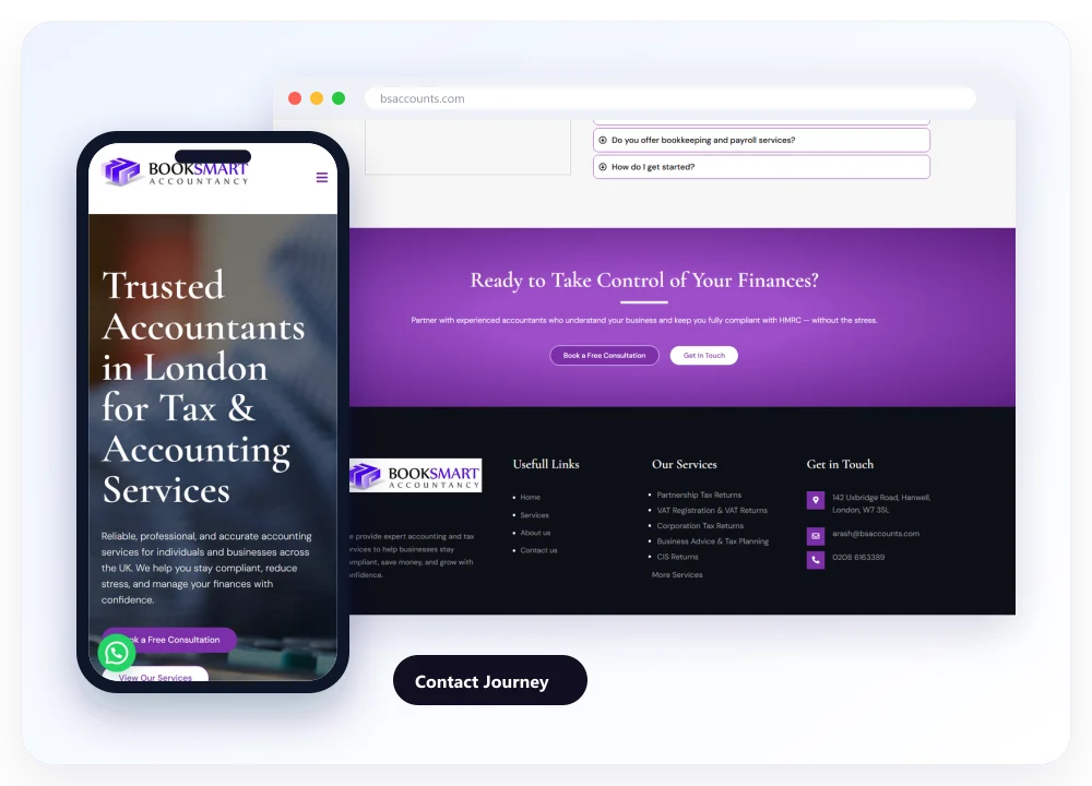
Phone, email and a simple contact form sit on every page, with clear calls to action after each section. Every form and call click is tracked in Google Analytics 4.
The redesigned website on desktop and mobile, with clear service pages, plain-English content and contact routes on every page.
Hover over a screen and scroll to explore the live website. Open bsaccounts.com
Measured improvements from a complete website redesign.
Fewer visitors leaving after one page in the first 90 days.
Visitors stayed to read service pages instead of leaving.
Mobile load time cut from 4.4 to 2.3 seconds.
Fixing the basics made the biggest difference. Proofread, plain-English pages kept visitors reading and clear service pages answered their questions. With contact routes visible everywhere, the website became a steady source of new enquiries for the first time.
“Our old website was letting us down, and we knew it. CodeCrackers rewrote and redesigned everything, and it finally reflects how we work: clear, simple and professional. New clients now tell us the website is what made them pick up the phone.”

A fast, mobile-first rebuild that turned local searches into steady enquiries.
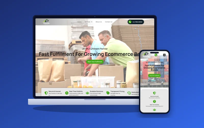
Seller-specific pages and a clear quote route that won new ecommerce clients.

Before-and-after service pages and fast galleries that let the work sell itself.
Whether your website needs a refresh or a full redesign, we'll look at what's holding it back and show you what's possible.