

Main Objective
Help shoppers find the right product and buy with confidence.
A Shopify store redesign for a Canadian natural wellness brand selling magnesium body care, essential oils and home sprays. We reorganised the catalogue around products and routines, rebuilt the product pages and shortened the path to checkout. Shoppers now find their fit and buy faster.
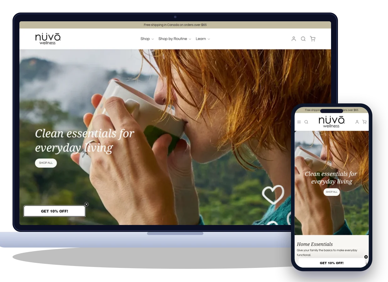
Nuvo Wellness Canada is an online store selling natural wellness products across Canada. Their range covers magnesium body care, pure essential oils and roll-ons, pillow and room sprays, hair and scalp care, and kids' wellness. Orders over $65 ship free.
As the range grew, the old store struggled to keep up. Products sat in long, mixed lists, and product pages said little about how to use each item. Mobile shoppers had to scroll endlessly to find anything, and many left before they reached the basket.
Help shoppers find the right product and buy with confidence.
Higher conversion, bigger baskets and faster mobile pages.
Nuvo had a loyal following and a growing range. But four connected problems on the old store made shopping harder than it should be, and each one made the others worse.
Oils, sprays, body care and hair products sat in long, mixed lists, so shoppers couldn't browse by what they needed.
Shoppers gave up searching.
Pages showed a product and a price but little on scent, size or how to use it, so first-time buyers hesitated.
Browsers weren't sure enough to buy.
Products that work together were sold separately, so shoppers rarely discovered a second item for their routine.
Baskets stayed small.
Most shoppers arrived on phones, but slow images, cramped menus and long pages made buying on mobile a chore.
Mobile visitors left before the basket.
What the client wanted to achieve: a calm, organised store that helped shoppers find the right product quickly, understand how to use it and build a routine. They also wanted a smooth path from phone to checkout.
Before redesigning anything, we studied the old store, leading natural wellness brands and how shoppers browse and buy on their phones.
We reviewed analytics, navigation, product pages and mobile speed to find where shoppers dropped off before checkout.
We studied leading natural wellness stores: how they organised their ranges, presented products and encouraged shoppers to add a second item.
We mapped three shopper types: people winding down at night, people refreshing their home and parents buying for their kids. For each, we noted what they look for first.
Shoppers buy routines, not single bottles, so we organised the store by product and by routine, with clear pages that build confidence.
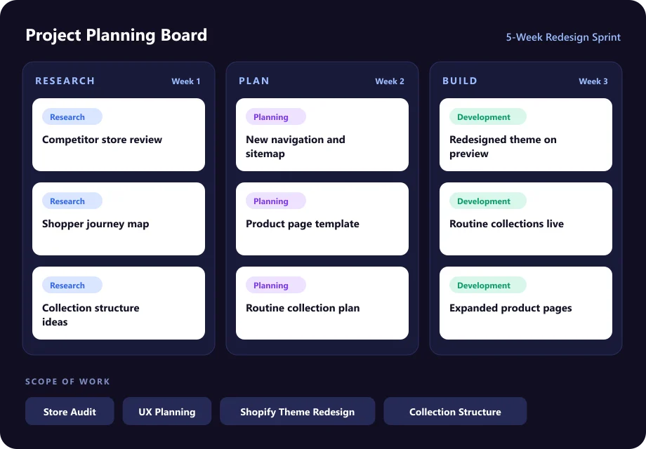
A structured five-week approach kept every stage transparent and on time. Select a stage to see what happened.
We started with a full review of the old store and its analytics. We then spoke with the team about best-selling products, common customer questions and where sales were being lost.
Drag the handle to compare the original store with the redesigned version.
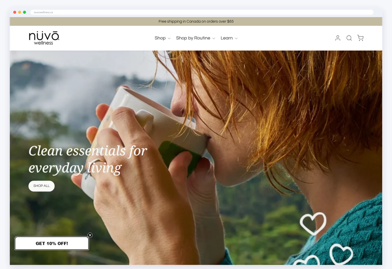
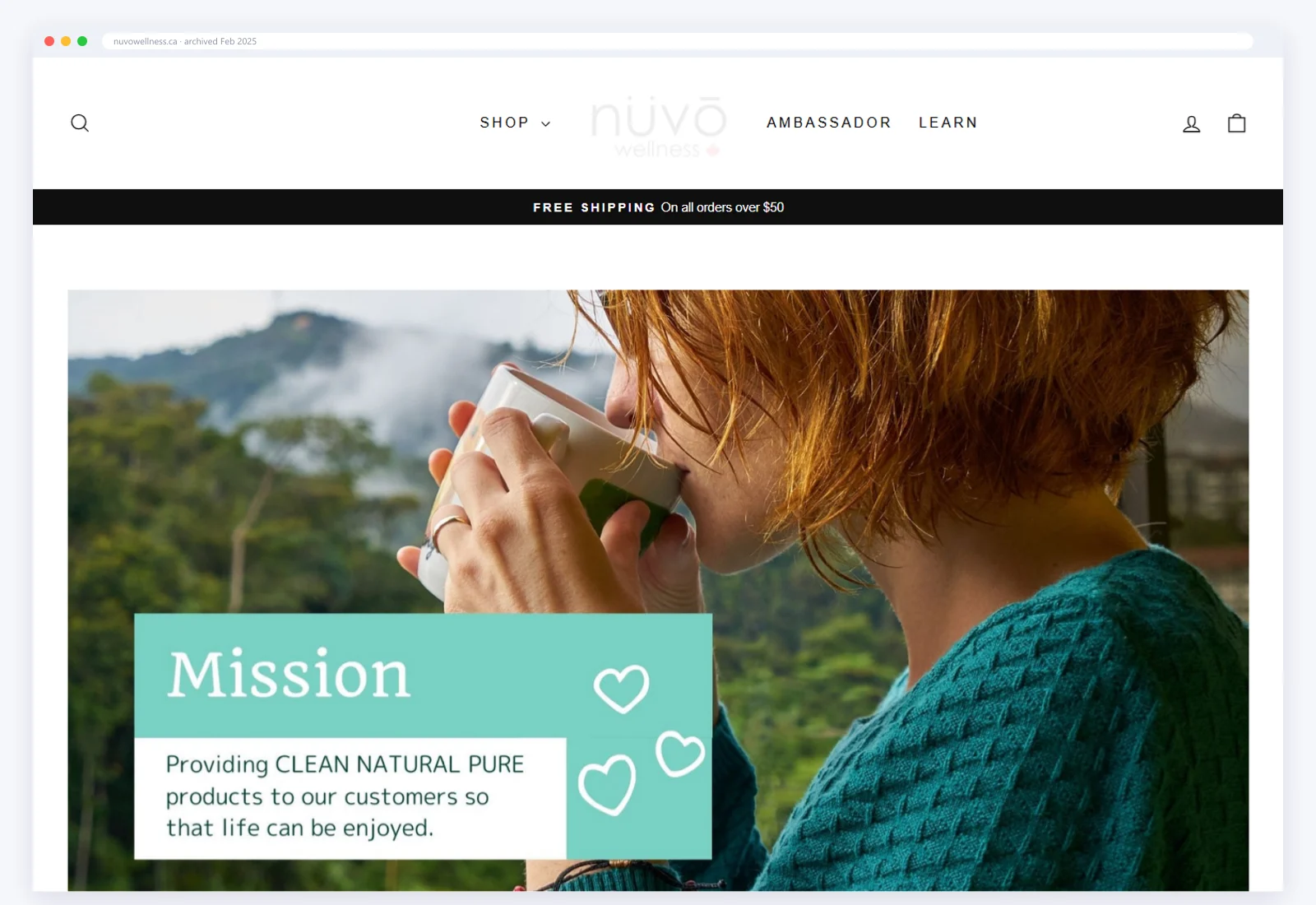
The “before” view is the storefront archived in February 2025 (Wayback Machine). The “after” view is the live store.
Four connected workstreams, each one solving a specific part of the challenge.
We regrouped the range into clear collections: magnesium body care, essential oils, roll-ons, pillow and room sprays, hair and scalp care, and kids' wellness. Each one is a tap away from the main menu.
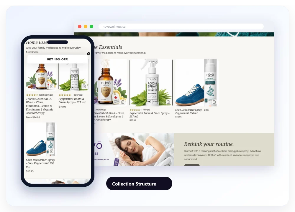
Every product page now covers size, scent, how to use it and what to pair it with, alongside customer ratings. First-time buyers can choose with confidence.
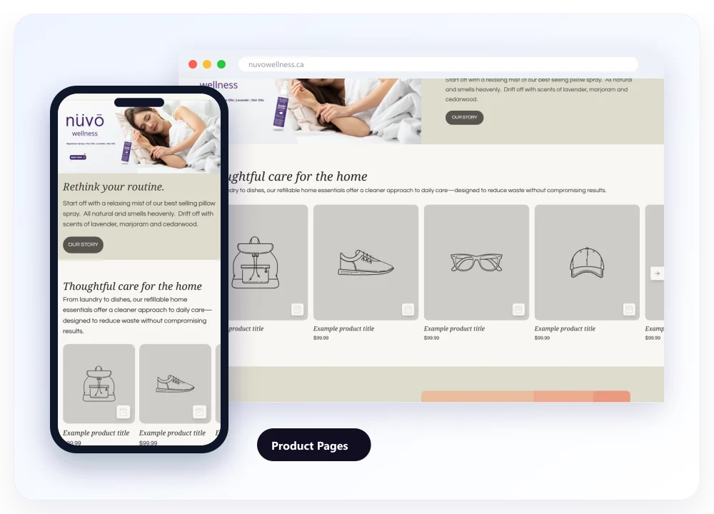
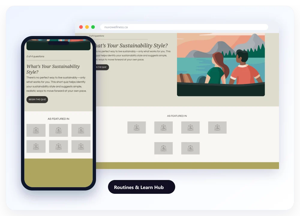
The Wind Down and Refresh Your Home collections group products that work together. A Learn section with how-to guides helps shoppers explore the range, and the free shipping threshold is shown clearly throughout.
Images were compressed and resized, menus simplified and buttons enlarged. The path from product to checkout now takes fewer taps on any phone.
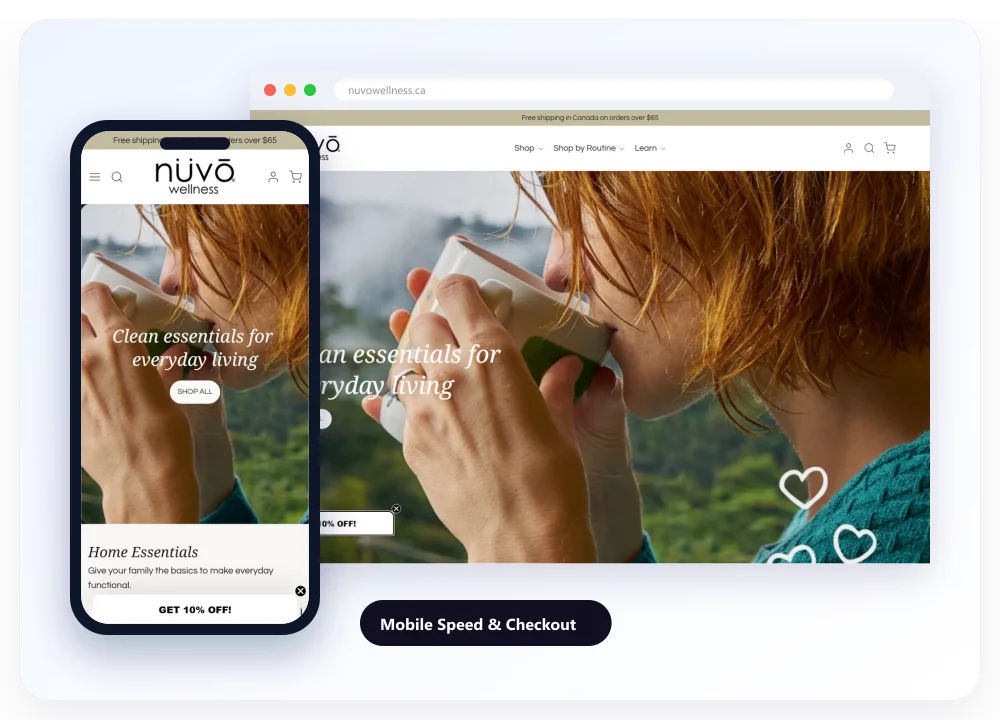
The redesigned store on desktop and mobile, with clear collections, routine collections and detailed product pages.
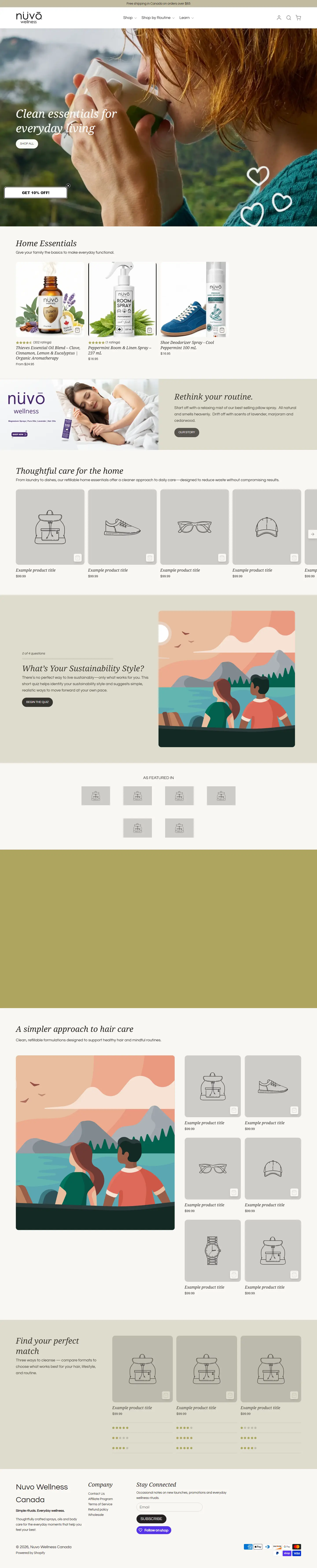


Hover over a screen and scroll to explore the website. Open www.nuvowellness.ca
Measured improvements from a focused Shopify redesign.
Orders per visit in the first 90 days, compared with the previous 90.
Routine collections encouraged shoppers to add a second item.
Collection pages cut from 4.9 to 2.9 seconds.
Making the store easier to shop did most of the work. Clear collections helped shoppers find products, detailed pages gave them confidence, and routines encouraged a second item in the basket.
“Our products were always good, but the old store made them hard to find. CodeCrackers reorganised everything around how our customers actually shop. The site feels calm and simple now, people find what they need quickly, and we're seeing more orders with more in each basket.”

Plain-English service pages and clear contact routes that rebuilt client trust.
A conversion-focused Shopify store with organised collections and a simpler checkout.

Rebuilt listings, structured PPC and aligned stock for a home essentials brand.
Whether your store needs a refresh or a full redesign, we'll look at where shoppers drop off and show you what's possible.